Effective report visualization: an example
26 Oct 2018 - Aaron Dodd
A few years ago we had inherited the support of several dozen applications from another vendor, partially because that vendor was not meeting their Service Level Agreement (SLA) obligations. After we started, we realized one of the issues was a lack of resources. Other efficiencies were needed, but people were as well. We effectively convinced the client to gradually expand the team to what we projected was needed, with the caveat that we would pay a severe penalty if the added people (and cost) did not bring SLAs up within a year and into compliance after two.
The delivery manager on that project had fifteen minutes to present our improvements to the client’s management, so the report needed to be brief and easy to understand, ideally fitting on one PowerPoint slide. I had recently read Edward R. Tufte’s amazing book The Visual Display of Quantitative Information, so when he reached out for help I was excited to apply the concepts to something concrete.
Determining the message
The first step we needed was to understand exactly what story we wanted to tell. Aside from our potential non-compliance fee, we certainly would not be renewed if we did not meet our goals, so showing our improvement was critical to keeping the client. Highlighting how well we improved support would also enhance our reputation, leading to more work.
We had also identified a potential area the client could improve, so finding a way to highlight this was important for our sales team.
After reviewing the amended contract and our activities, we developed the following objectives:
- Track the addition of people over the past two years
- Show our SLA compliance and mean-time-to-resolve (MTTR) for requests as these were the key performance indicators in our contract
- Graph the request volumes by severity, since higher severity tickets require more attention, and total volume is a measure of our throughput
- Add the client’s deployment counts since we knew these affected ticket volumes: whenever the client deployed new code, we were inundated with high severity tickets and this would give our account manager a segue into proposing an optimization of their deployment process (a potential upsell)
Gathering the data
One of my guiding principles is loosely based off Peter Drucker: “You can’t manage what you don’t measure”. Fortunately, we had the data to meet our story goals, although it required some effort to extract:
- Request volumes had to be queried from the ticketing system’s database since the built in reports didn’t work
- MTTR required matching ticket IDs with the activity in JIRA, since tickets were mirrored there and end users rarely marked tickets resolved in the ticketing system
- Deployments could be gathered from NewRelic, since each deployment set a flag so application performance could be tracked by releases
The end result was the following table in Excel:
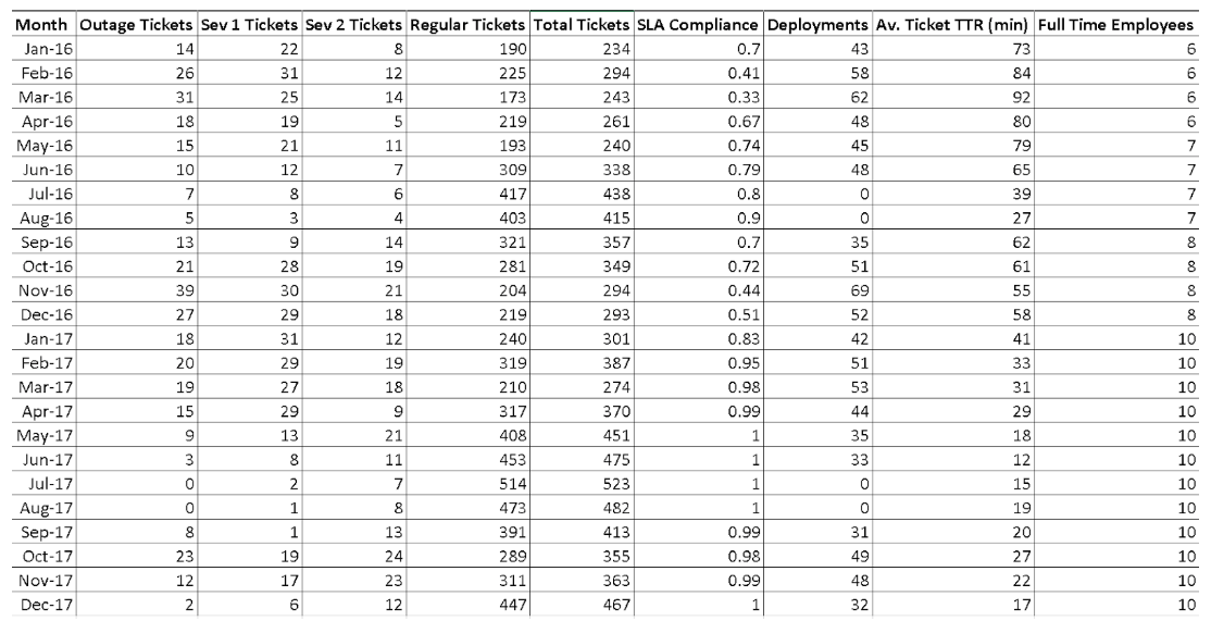
The first attempt
At this point, the delivery manager drafted an initial report for our account team to review and I went back to my regularly scheduled programming. A few days later, he sent me the following, along with a long textual explaination, that the account team rejected:
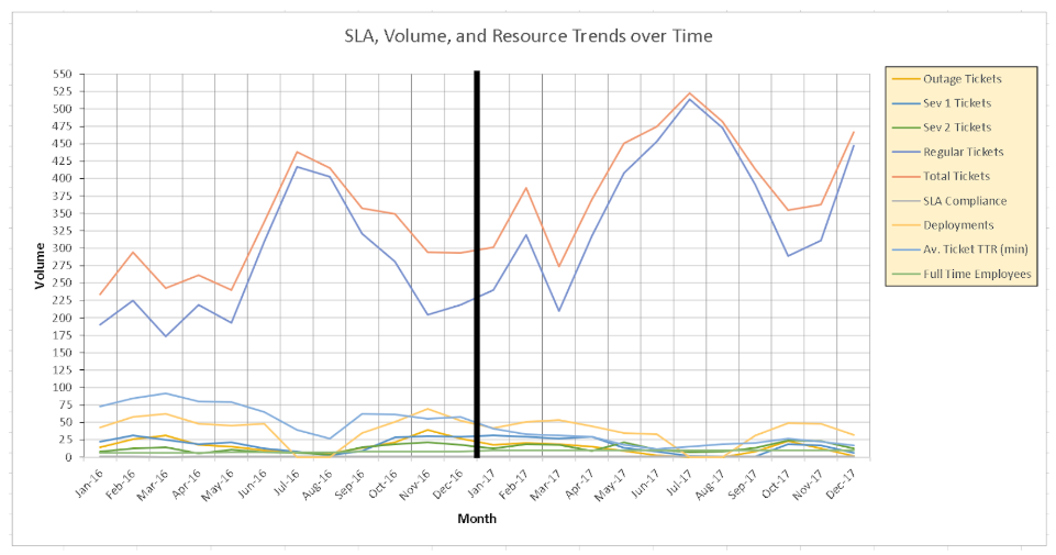
I admit, I was scratching my head looking at the chart.
I ignored the explaination, and asked him to step me through it. The points we wanted to address are indeed in there. They are just lost, drowning in a combination of mis-aligned scales and jumbled elements. When he sent three separate graphs, the story was coming together, but still lacking and would not fit on a single slide.
We went through a few iterations to clearly show the message, but before I get to that, let’s pick this apart with Tufte’s help.
The single chart of all metrics is a “visual puzzle” which requires the reader to “interpret through a verbal rather than a visual process” (Tufte, 153)1. Executives have limited attention spans and time, so the more concise we can present our data, the more likely our point will be made.
Tufte says that “graphics can be designed to have at least three viewing depths: (1) what is seen from a distance … (2) what is seen up close and in detail … and (3) what is seen implicitly, underlying the graphic” (Tufte, 155)1. From a distance, nothing in this chart is significant. Total Tickets and Regular Tickets are the highest two lines. But, Total Tickets is not necessary information since it just sums the other metrics. Trying to drill down, with Regular Tickets so high and still tied to the same vertical axis as the other metrics, the lower lines are lost in a tangle of visually similar values, hiding any information they should show. Implicitly, no trends or correlations are obvious.
The black bar in the center was intended to show the break between 2016 and 2017, also delineating the change between starting to add more people and finally having a full team. Instead, it stands out as the first thing the eye sees and conveys no meaningful information.
The gridlines are heavy, with both horizontal and vertical lines. The left axis is dense, with too many labeled points. The legend’s border and background are unnecessary, as is its placement to the right, cutting into the graph area. The axes are labelled poorly, with text on the vertical oriented sideways and generically called Values. The horizontal label is redundant since the axis points clearly convey their meaning. Since “every bit of ink on a graphic requires reason” (Tufte, 96)1, these elements are “chartjunk”, distracting or extraneous flourishes that add no value (Tufte, 113)1.
Another issue I saw was in placing metrics of various values on the same scale. SLA Compliance is a value from 0 to 100, meaning it will never be above the lower lines of the graph. Full Time Employees started at 6 and ends at 10, making it nearly invisible. Even among the ticket counts, Regular Tickets reach 498 while the high severity (and more important) tickets never exceed 40.
Glancing back to the original data table, I can divine more information reading that than I can from this chart.
Revising
The first item I wanted to address was the wide disparity between the lines shown. Since Total Tickets is redundant information, I removed that metric completely. It was only included it since we thought it would be too much effort for someone to understand the scale of requests, but “it is a frequent mistake in thinking about statistical graphics to underestimate the audience … why not assume that if you understand it, most readers will, too?” (Tufte, 136)1.
The Regular Tickets scale was far larger than the severity tickets, so I added a second vertical axis just for that measure. This allows us to show a comparative change in each type of ticket at a similar view, while still giving the reader the underlying numbers. In this way, trends of each type of ticket and their relations to each other are more accessible.
This left me considering the other metrics: SLA Compliance, Av. Ticket TTR, and Full Time Employees. These do not match the scale of the ticket counts, so they should be moved to separate graphs. But, the relationship between these three I still wanted to compare (less employees correlate to higher response times and lower compliance). To keep these together I changed the scale. For the left vertical axis, I kept the SLA Compliance range, but set the minimum and maximum values to the actual data end points (0.2 and 1.0) instead of arbitrarily starting at 0.
The Full Time Employees ranged from 6 to 10 and the Av. Ticket TTR (min) ranged from 17 minutes to 92 minutes. On consideration, the TTR times below 20 minutes weren’t really relevant (20 could be a good cut-off point since it would be unreasonable to resolve a ticket in 0 minutes). I decided to alter the scale of that metric to min/10, reducing a time of, for example, 98 minutes to a value of 9.8. This would then show the TTR metric with the same 0 to 10 range as Full Time Employees. Since the SLA axis was set from 0.2 to 1, I created a right axis for Employees and TTR (min/10) ranging from 2 to 10.
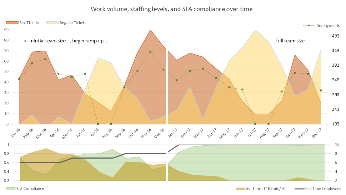
The original graphic attempted to combine two time periods on one graph: 2016 versus 2017. I still wanted to keep this idea, as the time progression naturally leads for a left-to-right viewing and breaking the charts up by year would create duplication of various non-data-ink elements. Instead, I decided to create a quadrant graph out: the left column would show 2016 data and the right would show 2017; the top would show ticket values and the bottom would show compliance, time, and team members. The horizontal axis remains the same, so I kept only one label for that.
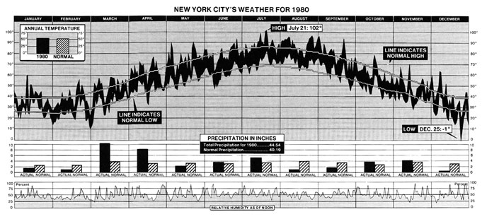
I took inspiration for this stacked chart form from New York City’s Weather for 1980 below (Tufte, 30)1 as it kept the horizontal axis the same while combining related sets of data. This lets one vertically compare various metrics at different scales along the same time line while still able to compare the period as a whole.
Next, the awful black line in the original graphic was erased completely, including the underlying data-ink, to create a white line running down both charts to subtly separate the years. I used the horizontal axis as the division between the top and bottom graphs. Combined with the white line, this creatively uses text and whitespace to create the quadrants.
The vertical grid lines and axis lines were removed. For the data lines, if a graphic suggests a horizon then it “also suggests that a shaded, high contrast display might … be better than the floating snake” (Tufte, 187)1, so I filled the areas. Not satisfied with multiple metrics overlapping and hiding each other, I set a transparency to allow the reader to still view each area and line.
Since there is no intuitive hierarchy between colors, but variations of shading imply a direct order (Tufte, 154)1, I decided that Outage Tickets, being the highest severity, should be red with Sev 1 being an orange and Sev 2 being a yellow, using an intuitive temperature order. The Regular Tickets I assigned a neutral blue as they are far less important, but also worth highlighting as a contrasting measure.
I still wanted to show the impact of Deployments on the workload, but there was no particular importance order to that measure, so a colored area felt arbitrary and distracting, muddying the order given to the other tickets. Instead, I left that as a line but with the weight reduced and the points themselves increased. I decided similarly for the Full Time Employees measure as it was essentially just an increasing line and didn’t need to cover the SLA or TTR values.
Lastly, my point about the left versus right portions needed some highlighting. Since Tufte says “use words, numbers, and drawing together” (Tufte, 177)1, I decided to write directly on the chart, as well as to clearly describe the vertical axis.
The result of these alterations is below:
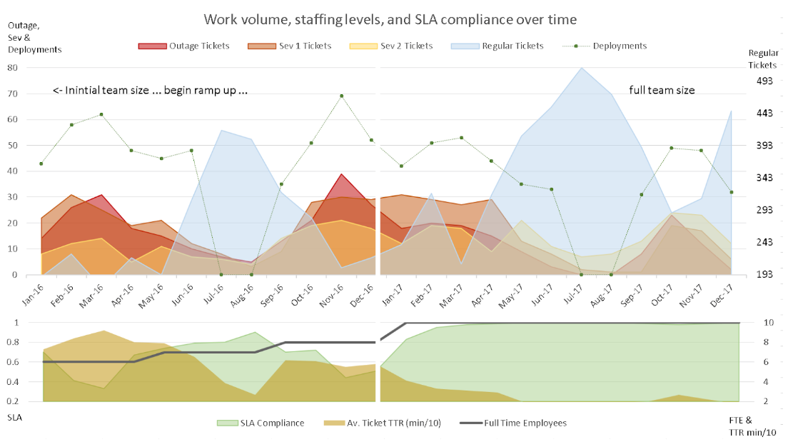
I can quickly see the request volumes and how deployments align to increased high-severity work. The inverse valleys and peaks of deployments to regular requests is shown. The impact of the number of employees to the key performance indicators for our group are quickly discerned at the bottom. Between the two graphs, it is even possible to see that, while the number of tickets and deployments remain on average the same, the response times and compliance are much improved in 2017.
Another revision
“Just as a good editor of prose ruthlessly prunes out unnecessary words, so a designer of statistical graphics should prune out ink that fails to present fresh data-information” (Tufte, 100)1.
We had fun coming up with the revised chart, but why stop there? We wondered if the breakdown of severity tickets is even required. If I combine Outage, Sev 1, and Sev 2 I can further simplify the graph while still showing the correlations with deployments and regular work. For a front-line manager like myself, I would care about the severity details, but as a summary for executives, it could be irrelevant.
I could reduce the non-data-ink even further by removing my axis-labels and combining the legend with the related axis, which might be a little off-putting on first glance but feels more intuitive.
Our final revision:
Merging the higher severity tickets together added another dimension to the story: you clearly see regular requests increase when deployments are low, and severity requests increase with deployments. This allowed us to dig further and discover many on the development side were simply sitting on new work while preparing for a deployment, and submitting their backlog when they had time. This was another point our sales team could add to the deployment optimization proposal.
Conclusion
Far from being a theoretical book, Tufte’s The Visual Display of Quantitative Information is a practical guide for designing compelling statistical graphics. It does not give a how-to approach so much as best practices supported with real-world examples.
The key points used here were:
- Start with the story–what does (or should) the graphic portray–then think how to visualize it.
- Non-data “ink” should be kept to a minimum. Extraneous marks detract from the data, which should be the focus (gridlines can be subdued or often removed).
- Don’t be afraid to use white space, even erasing parts of the graphic.
- Multivariate data needs to be related and properly scaled.
- Colors have no inherent order, but using related colors (shades or “temperature”) can imply priority. Avoid assigning random colors.
- Lines that suggest a horizon generally work better with shaded areas. Opacity can help highlight overlaps without hiding information.
- If multiple sets of data tell a coherent story together, don’t be afraid to get creative in combining them.
- Avoid duplication (of data and other elements) and arbitrary axis scales.
This is just a small use of the concepts. I highly recommend the book to anyone who has to visualize information.
References and further reading: